Brand Identity Design
Mannions Pub.
Mannions is a beloved local pub with a strong reputation and loyal following. The goal of this project was to create a refreshed visual identity that feels modern while staying true to its roots. The final branding balances tradition with a clean, contemporary look that reflects the character of Mannions.


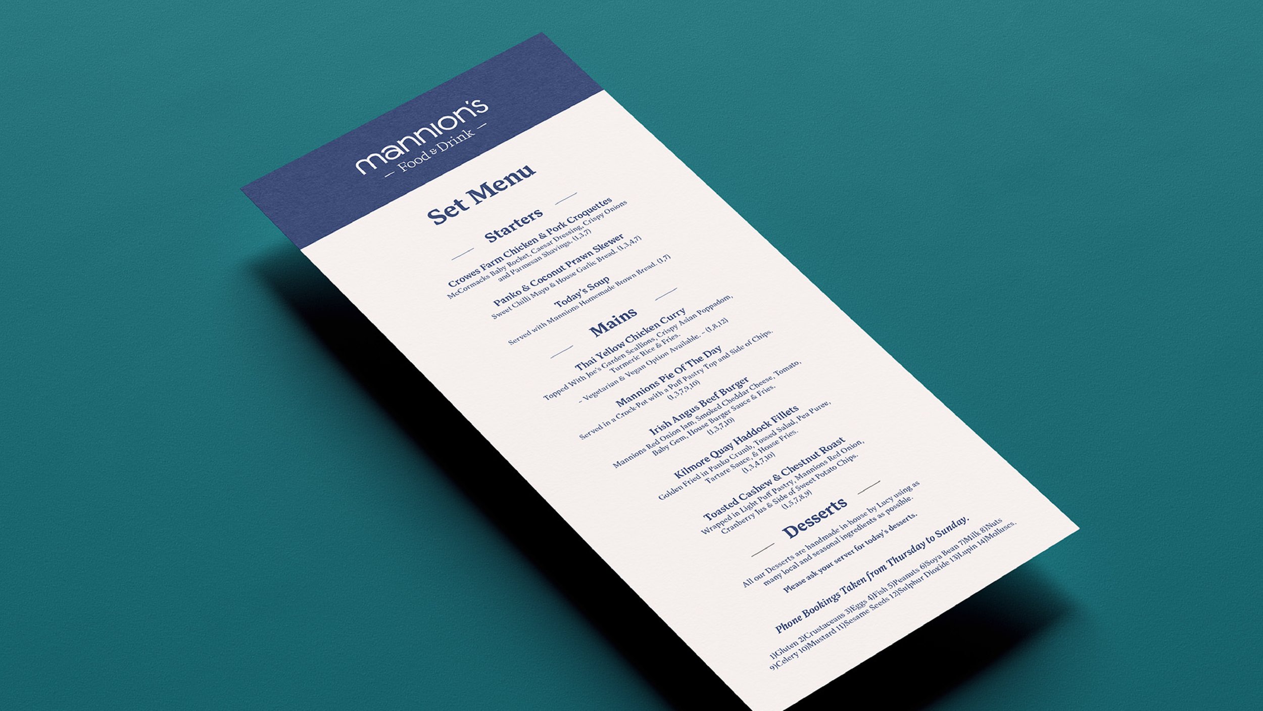
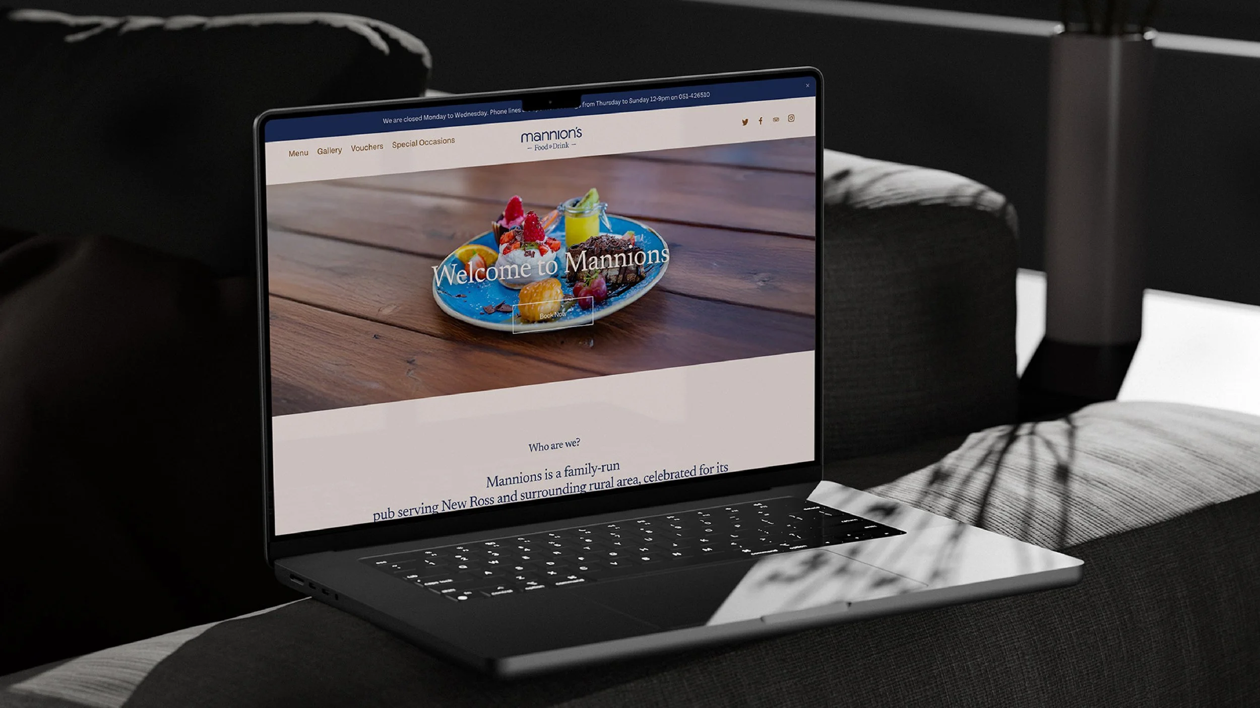
This project included a brand refresh across all touchpoints including print and digital, such as signage, menus, uniform, social media and web design.
A complete brand.

My process begins with detailed research and mood boards alongside playful concept generation. The Mannions re-brand required a delicate balance between contemporary design and the familiar character that regulars know and love.
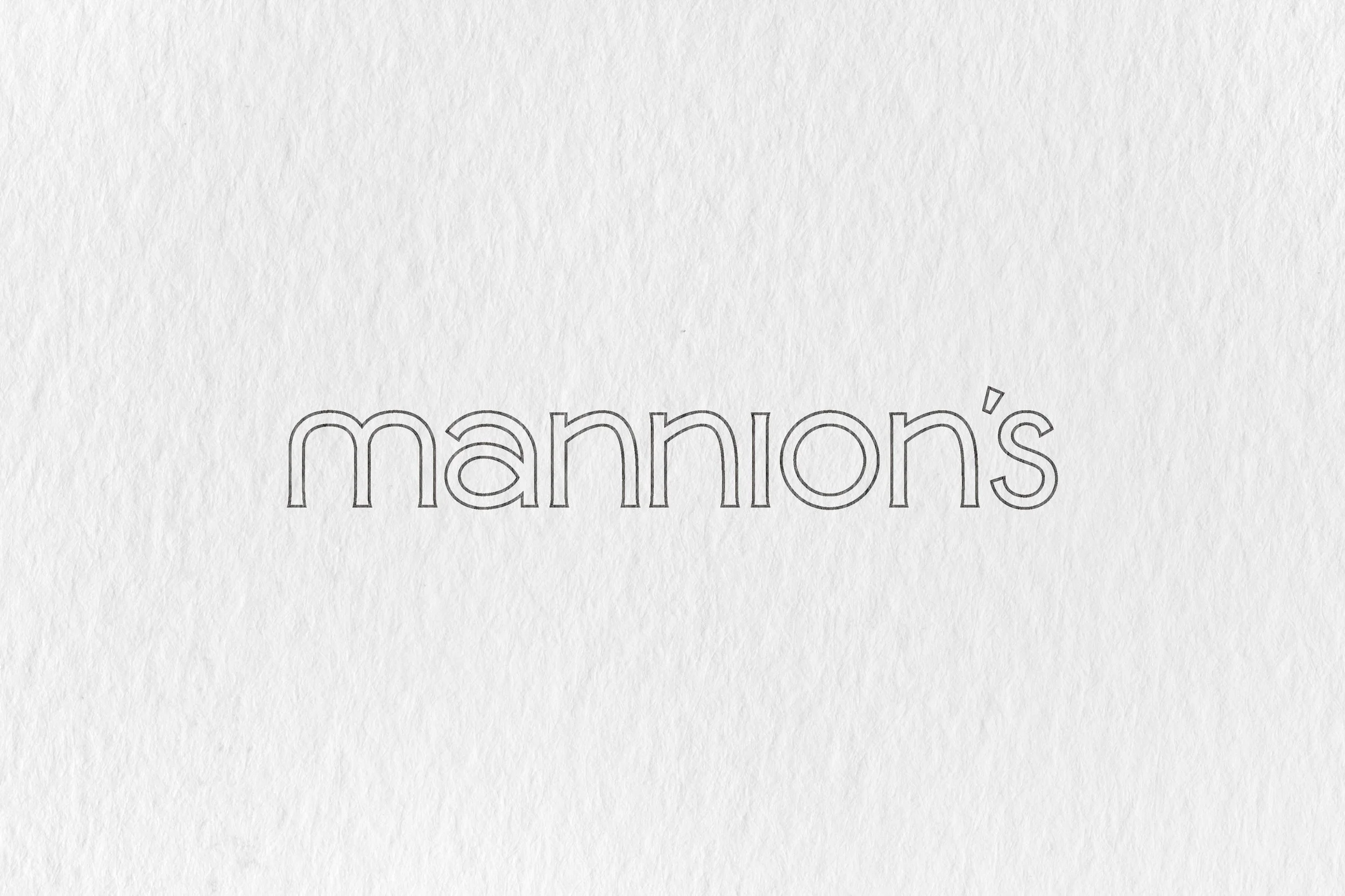
The wordmark was crafted as a fully custom type design, tailored specifically for Mannions.
Bespoke typography.